When did you last open a work tool and think: this is pleasant to use?
Now think of the tools your team built in the past year with AI. The forecast checker, the supplier scorecard, the little app that reads delivery confirmations. They work. The numbers are right. Are people still using them?
Many of those tools die quietly. Not because the logic is wrong, but because the screen is a grey wall of fourteen equal columns, the button you need is hidden, and nobody can tell whether the data is from today or from last Tuesday.
AI has made building a working tool cheap. Making one that looks trustworthy and is easy to use is now the difference between a demo and a habit. The good news: you do not need to be a designer for that. You need a handful of rules and a component library that does the heavy lifting.
What a component library is
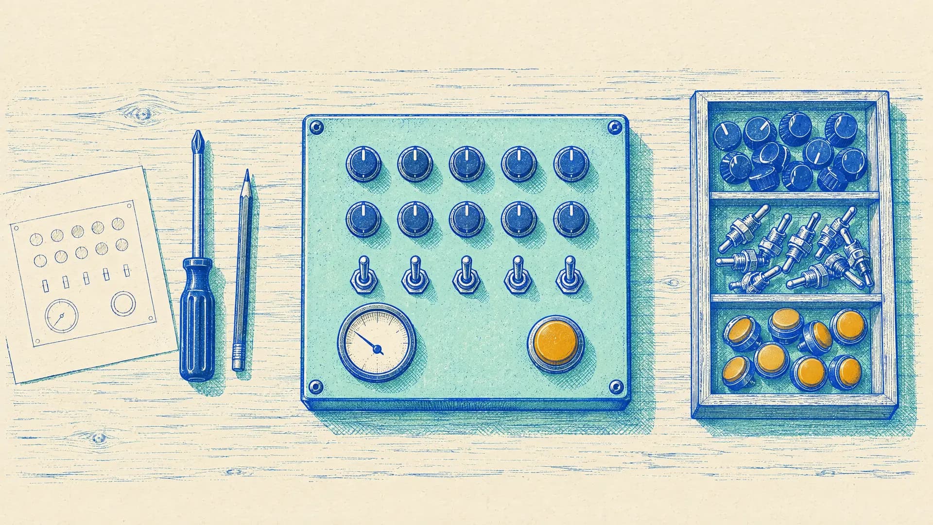
A component library is a box of ready-made screen parts: buttons, tables, forms, menus, date pickers, dialogs. Each part already has sensible spacing, colours, focus states and keyboard support. You assemble screens from them instead of drawing every element yourself, and the result looks consistent because every part comes from the same family.
That matters more now than five years ago. When you ask an AI coding tool for "a dashboard", it has to pick some look. Point it at a named library and it reaches for parts that were designed together. Leave it open and you often get a mix of styles.
The libraries worth knowing, with figures I checked on 12 October 2026:
| Library | What it is | Price | Reach for it when |
|---|---|---|---|
| shadcn/ui | Components the CLI copies into your own project, so you own and edit the code | Free, MIT licence | You build with AI coding tools in React and Tailwind |
| Material UI (MUI) | Google's Material Design as ready components; version 9 since April 2026 | Core free; MUI X Pro and Premium from $299 a year | You need heavy data grids, schedulers and a familiar look |
| Mantine | A large set of components and hooks; version 9 since March 2026 | Free, MIT | You want forms, dates and notifications without assembling them |
| Ant Design | A design system aimed at dense admin screens; version 6 since November 2025 | Free, MIT | Your tool is mostly tables and forms |
| Fluent UI | Microsoft's design system | Free, MIT | Your tool lives next to Teams and Office |
| Base UI, Radix, React Aria | Unstyled foundations: behaviour and accessibility, no look | Free | You want full control of the look, or a library built on them |
| Tailwind CSS | Styling utilities most of the above sit on; version 4.3 since May 2026 | Free, MIT | Almost always, as the layer underneath |
shadcn/ui is the one that matters most for AI builders. It has about 125,000 stars on GitHub and close to 12 million npm downloads a week. Because the code lands in your project, an AI assistant can read and change every component. Since December 2025, `npx shadcn create` lets you pick a style, colours, fonts and icons, and rewrites the components to match. Since July 2026 new projects sit on Base UI by default, with Radix still supported. This site runs on it.
Two pieces of news to watch. MUI skipped version 8 entirely, to line its numbering up with MUI X. And on 9 September 2026 Tailwind Labs announced it is joining Shopify; Tailwind itself stays MIT.
Next to the libraries, a few helpers worth bookmarking:
- Mobbin: a searchable library of real app screens and flows (it cites 621,500 screens). Look up how ten good apps do a filter panel before you build yours.
- Figma: free Starter plan, with Figma Make for turning a prompt into a clickable prototype.
- v0 and Lovable: AI app builders with free tiers (7 messages a day on v0, 5 credits a day on Lovable) to try a screen idea in minutes.
- Laws of UX and Nielsen's ten heuristics: two short reference pages that explain why a screen feels wrong, in plain words.
What it means for supply chain
A useful tool has three layers. Each one answers a different question in the user's head.
| Layer | The user's question | What breaks it | Where the fix comes from |
|---|---|---|---|
| It works | Is this number right? | Wrong logic, stale data | Your process knowledge and tests |
| It looks tidy | Can I trust this? | Misaligned columns, five shades of blue, mixed fonts | A component library |
| It feels easy | What do I do now? | Every field equally loud, jargon, no feedback | Design rules and one user test |
Supply chain people are usually strong on the first layer. The second and third get skipped, and the Laws of UX site has a name for why that hurts: the aesthetic-usability effect. People see attractive designs as more usable, and forgive them more.
Six rules cover most of the second and third layers for the tools we build:
Start from the decision, not the data. The first screen answers the question the user opens it for, such as "which orders are at risk today?", and the full extract sits one click away.
One main action per screen. Hick's law says the time to decide grows with the number of choices, so make the next step obvious and push the rest into a menu.
Show the state of the system. A "data as of" time, a loading state, a clear empty state and an error message that says what to do. This is Nielsen's first heuristic, and planners check it before anything else.
Speak the user's words. "Promised date", not "dt_prom", and units in every column header. Match the terms used in your ERP and your S&OP meeting.
Treat the table as the product. Right-align numbers, keep decimals consistent, use thousand separators, freeze the header, and let people sort and filter.
Never use colour alone. A status needs a word or an icon next to the red or green. WCAG 2.2 asks for a contrast of at least 4.5:1 for normal text and 3:1 for buttons and other controls.
Rules on paper are easy to agree with. The way to feel the difference is to give an AI builder the same data twice: once with the rules, once without.
Try this: a returns desk screen, with and without rules
Run it in an AI app builder such as v0 or Lovable, or in Claude or ChatGPT with an artifact or canvas. First paste only the first line and the data, and look at what comes back. Then paste the whole prompt. The data is illustrative and belongs to a fictional bicycle maker.
You are building an internal tool for the returns desk at a fictional bicycle maker's distribution hub. The returns coordinator uses it on a tablet, standing at the inspection bench.

Task: build a single-screen returns triage app from the data below. Use React with shadcn/ui and Tailwind (or the component library your tool uses by default, and tell me which).

Design rules:
1. The screen answers one question first: "what do I inspect next?"
2. A summary row on top with three figures: returns waiting for inspection, returns open for more than 7 days, and safety-related returns (cracks, swelling, anything that could hurt a rider).
3. Safety and overdue rows stand out, with a word or icon as well as colour.
4. One main action per row: "Inspect". Other actions go in a menu.
5. Values right-aligned in euros with a thousand separator. Plain column names with units.
6. Status as a badge with text. A visible "data as of" time, an empty state and a loading state.
7. Text contrast at least 4.5:1, touch targets large enough for a gloved finger.
8. If you see a pattern across rows that the coordinator should escalate, show it.

Data (today is 12 October 2026):
rma,received,dealer,item,reason,value_eur,days_open,status
RMA-2201,2026-10-01,Velo Gent,Gravel E frame M,Paint chip,640,11,Waiting inspection
RMA-2202,2026-10-02,Rad Köln,Road battery 500Wh,Will not charge,420,10,Waiting inspection
RMA-2203,2026-10-05,Cycles Lyon,Road wheelset,Wrong item shipped,310,7,Approved refund
RMA-2204,2026-10-06,Fietsen Utrecht,Gravel frame L,Crack at weld,580,6,Waiting inspection
RMA-2205,2026-10-07,Velo Gent,E-bike charger,Dead on arrival,65,5,Approved replace
RMA-2206,2026-10-07,Bici Milano,Road E bike S,Motor noise,3150,5,Waiting inspection
RMA-2207,2026-10-08,Rad Köln,Saddle,Customer changed mind,45,4,Rejected
RMA-2208,2026-10-08,Cycles Lyon,Gravel bike M,Transport damage,1890,4,Waiting carrier claim
RMA-2209,2026-10-09,Fietsen Utrecht,Road battery 500Wh,Will not charge,420,3,Waiting inspection
RMA-2210,2026-10-10,Bici Milano,Brake set,Leaking hose,120,2,Waiting inspection
RMA-2211,2026-10-11,Velo Gent,Road battery 500Wh,Swelling,420,1,Waiting inspection
RMA-2212,2026-10-12,Rad Köln,Gravel E frame M,Paint chip,640,0,Received

Output: the working app, then a short list of the assumptions you made and which rules you could not apply.What you should see
The bare version usually gives you a tidy but flat table: twelve rows, eight columns of equal weight, maybe a search box. Correct, and no help at all at the bench.
The full version should show:
- Summary: 7 returns waiting for inspection, 2 open for more than 7 days (RMA-2201 and RMA-2202), and 3 safety-related: the cracked weld on RMA-2204, the swollen battery on RMA-2211 and the leaking brake hose on RMA-2210. A build that only matches the words "crack" and "swelling" misses the brakes.
- The edge case: RMA-2203 has been open exactly 7 days, so it is not overdue. A careless build counts it.
- The pattern: the Road battery 500Wh came back three times from three dealers in ten days, once with swelling. That is a supplier quality alert, not three separate returns, and it belongs at the top.
- Order: the safety rows first, not the oldest paint chip.
Why the rules matter
The data and the AI were the same both times. What changed is that the rules told the builder what the user is trying to decide. A component library made both versions look neat; only the rules made the second one useful. That is the split worth remembering: the library gives you tidy, you still have to supply easy.
What it can't do, and the traps
- A library cannot fix a confused screen. shadcn/ui will render fourteen columns beautifully. Deciding which three matter is still your job.
- Mixing libraries. Material UI next to shadcn/ui next to a table you found online looks patched together. Pick one and stay with it.
- Copied code is your code. With shadcn/ui the components live in your project, so updates do not arrive automatically. That is the price of full control.
- Licences and paid tiers. The cores are free, but advanced grids and charts often sit in paid tiers. MUI's pricing page and its version 9 announcement describe the licensing differently, so read the current terms before you commit.
- AI builders claim more than they check. Ask for 4.5:1 contrast and you may get a sentence saying it was applied. Test it with a contrast checker, and test the screen on the actual tablet.
Watch one person use it
Pick one tool your team built this year. Sit next to someone who did not build it, give them a real task, and keep quiet for five minutes. Write down every moment they hesitate. That list is your design backlog, and most items on it are an afternoon's work with the rules above.
For years supply chain people put up with clumsy systems because someone else built them. Now we build our own, and we get to decide that they will be pleasant to use.
Which tool in your day do you open only because you have to, and what is the one change that would make you open it gladly?
Sources
- shadcn/ui changelog
- shadcn/ui: shadcn create (December 2025)
- shadcn/ui: Base UI as the default (July 2026)
- Introducing MUI v9 (MUI blog) and MUI pricing
- Mantine 9.0 changelog
- Ant Design changelog
- Fluent 2 design system (Microsoft)
- Base UI, Radix Primitives and React Aria releases
- Tailwind CSS blog and Tailwind is joining Shopify
- Mobbin
- Figma pricing, v0 pricing and Lovable subscription plans
- Laws of UX
- 10 usability heuristics for user interface design (Nielsen Norman Group)
- WCAG 2.2: contrast (minimum) and non-text contrast